PANTONE COLOUR OF THE YEAR 2016
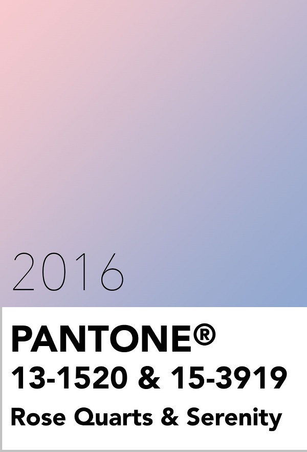
At the millennium, Pantone announced it’s inaugural Pantone Colour of the Year, a symbolic colour selection made by the Pantone Colour Institute, aimed at reflecting what’s taking place in the world, our lives and culture. Sixteen years later, and for the first time, Pantone chose a two shade combination for it’s Colour of the Year 2016, Rose Quartz and Serenity.
Pantone 13-1520, Rose Quartz is a persuasive and gentle tone that conveys compassion and composure, whilst Pantone 15-3919 Serenity is weightless and airy, like a clear blue sky. Together, these two colours aim to create a feeling of respite and relaxation as consumers and business people seek mindfulness and well-being to combat modern day stresses.
If this all sounds a bit much to you, just consider that in many parts of the world we are experiencing a gender blur in relation to fashion, which has in turn impacted on colour trends in other areas of design. This new approach to colour selection by Pantone strives to connect with a generation that has less concern about being typecast or judged in an increasingly digital and global landscape.
- Pantone 13-1520, Rose Quartz and Pantone 15-3919 Serenity are from the Pantone Fashion, Home + Interiors colour library.
- RGB for Rose Quartz: R: 247, G: 202, B: 201
- RGB for Serenity: R: 145, G: 168, B: 208
- HTML Web Design and Internet Publishing for Rose Quartz: F7CAC9, and Serenity: 91A8D0
- Pantone Plastics Chips: for Rose Quartz: PQ-13-1520TCX, and Serenity: PQ-15-3919TCX
- Pantone Solid Colours in print: Closest matches not available.
- Pantone CMYK: Closest matches not available.